Victorian Annex and Workspace for a Period Property
Posted: May 26, 2016 - 15:37
By: Emma Page
Comments: 0 comments
Tags:
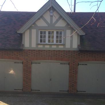
The owners ran a marketing consultancy firm from an office at home and required a workspace within the grounds of the house. The solution was to create a cosy Victorian annex. Due to the size of the garden and other requirements that the owners had, a large 3 bay garage was also required in which to park a ride-on lawnmower, their classic car and house their large quantity of materials accumulated over many years.
The Victorian country house and 1-acre garden were purchased in 2010. What was once a medium-sized middle-class Victorian house was now sitting on a large plot relative to its size, especially compared to modern builds on much smaller plots. The project was to maximise the potential of the house for the resale value of the property, whilst also accommodating the owners’ requirements. The property was on a sloping site with very undulating rough land to the rear with nowhere to sit and place garden furniture in order to enjoy the best aspect of the property. So, they also needed to re-landscape their garden and make it easier to maintain.
From previous experience, the owners knew that if they built a 3 bay garage with a pitched roof, by raising the roof height by only 1 metre or so, they could achieve a second storey within the building for only a small increase in cost. Once they had decided to purchase the property, this was the plan of action that they intended to follow.
The Big Challenges
Planning permission for the project was problematic because the property is in Green Belt land and the planners were adverse to a 2 storey building in the grounds of the house. However, after some negotiation, they saw the requirements were reasonable and that the outbuilding was not out of proportion to the house and grounds, and agreed to the 2 storeys, on condition that the building was sunk 2.1 metres into the ground so that the roof height did not exceed the height of the lowest gable on the main house and the building did not compete in size with the main house .
The extensive groundwork that this required significantly added to the cost of the build, but overall it was a compromise worth making. The owners devised a plan to dispose of the earth dug out for the foundations, which could have cost them around £15,000 to dispose of, by scraping the topsoil from their lawn into a corner of the garden, putting the sandy earth dug out for the garage down on top of where the lawn was previously to even out any uneven areas and relandscape the garden. They then and then made sure that the top soil was then spread over this earth and seeded. After 6 months, the property owners ended up with a better moss free lawn than they had previously.
Another challenge was the need to make the Victorian annex compliant to the standards required by Building Regulations in terms of using sustainable energy sources. To avoid excessive costs with adding an extra building to the gas supply as well as the work that this would entail, the owners did not plan to use mains gas in the annex, and so this was a challenge. The original proposal was to solely use electric heaters in the building, but this was refused by the Builder Inspector.
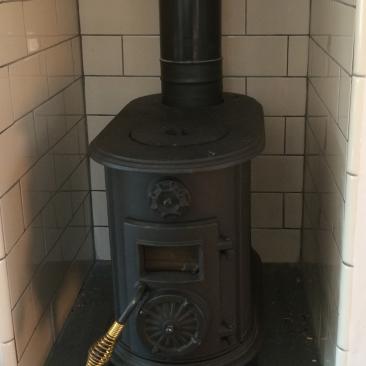
So, plans had to be modified to include a wood-burning stove, a fireplace and a chimney. As a proportion of the garden of the property is an area of woodland including 45 trees over 100 years old, this was a perfect solution to the problem. So far the owners have used only their own wood as a source of fuel for the stove in the annex and workspace. The further 3 fireplaces in the main house and the supply of logs they currently have stacked up look likely to last them many more years.
The Build
The build took place in April when in theory the weather should have been fairly dry and warm. However, this April was the wettest on record. The weather was horrendous with continual rain from the week the groundwork began - for a month and a half in total.
The groundwork, instead of taking 6 weeks, actually took 12 weeks to complete. However, after the ground-workers finally left, the Victorian annex build went fairly smoothly (other than the plans were found to be incomplete and ambiguous in places and the shell of the building was completed within another 8 weeks). The owners chose bricks laid in a Flemish bond style alternating red and black bricks to echo the brickwork on the main house. They also used reclaimed roof tiles from a number of reclamation yards as no one yard had all of the tiles they required.
Once the building was plastered, all of the trades left and the owners then took over - the exterior finishing and the interior fit out of the build began.
A New Build that shouldn’t look New
The owners’ next major challenge was to make the new build look as characterful as their main house - all on a tight budget. They are people that love period architecture and restoring old properties, although they believe you should not be a slave to history and should be able to enjoy the full benefits of modern technology. They enjoy modern amenities in their house such as a cinema system with surround sound and wireless technology for their music - but they can’t bear featureless interiors.
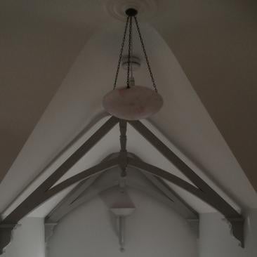
This is an issue that especially worried the owners and when the building was at the drawings stage, they developed a vision to add character to this blank canvas. Firstly, this involved instructing the plasterers to shape the ceiling of the annex into a series of vaulted curves which would also hide the steel trusses used to support the roof.
A major interior feature to the Victorian annex is its three roof trusses. These are strictly decorative and not in any way structural and were fabricated by the property owners out of elements that are widely available such as staircase newel posts and wooden decorative corbels. The major challenge was to create the curved pieces of wood that connect the central newel post with the corbels, and to install these heavy pieces of wood on the double height ceiling above the staircase.
The biggest bargain
The best bargain of the build was the flooring. Cheap pine tongue and groove planks were purchased from a local timber merchant for £800 to cover 70 square metres. They were laid, lightly sanded and then stained to a dark oak colour followed by 3 coats of heavy duty P67 squash court varnish. This gave the appearance of expensive oak flooring for a fraction of the cost, and now also benefits from a high sheen and hardwearing finish.
Elements used to add character to the new build
- Tongue and groove panelling - Costs less than £25 per square metre and elevated the walls from plain and boring to characterful and hardwearing. An old interior designers trick is to use a horizontal datum point to make a room look wider. This technique was used for this narrow room in the form of the dado rail which finished off the top of the panelling throughout the room. Nothing was wasted as offcuts of the tongue and groove were used behind the kitchen shelves.
- Brick shaped wall tiles – These were used in many different places in the fit out and at around £20 per metre, were also a bargain. Around the wood burning stove in the main living room, in the kitchen and in the bathroom to provide a hard wearing wipe clean surface.
- A black cast iron wood burning stove – This is small, efficient and compact and gives out a lot of heat for a minimal cost. At less than £400 from MachineMart, this was great value for money. A small stove was required, so a boat stove was used with a 2-3k heat output, more than adequate for the Victorian annex with it’s substantial insulation.
- Cast iron radiators – These can be adapted and used with an electrical supply without the need for mains gas. Available in a large choice of different sizes, styles and finishes.
- Anaglypta wallpaper - Used below the dado rail on the staircase and the hallway to give a period look and a hard-wearing finish to the walls.
- Solid wood curtain poles with brass brackets and rings - Added an air of period charm to the windows and although they were teamed with cheap curtains in a colour to match the walls, the use of the grey throughout make the whole space look well planned.
- Recycled elements from the main house - Such as the 1950s glass and ceramic light used in the centre of the room and an up-cycled butchers block with it’s legs painted to match the rest of the interior.
All of these elements give the Victorian annex a personality that it would not have had if the property owners had chosen elements which were mass produced.


Be the first to add a comment...